


Showing posts with label project. Show all posts
Oh no! (It's the last one!)
We were assigned one of two themes, either Interactivity or Re-do. I chose Re-do.
Re-do (v.): when you take a project or art piece you've done before and change something about it to change it (my definition- ha, take that dictionary.com!)
My layering and perspective projects were both somewhat of a redo. I went through my sketchbook and landed on facial features. Specifically, noses.

Remember, a Nose Knows?
Anyways, I was drawing Captain James T. Kirk and Spock from Star Trek the week previous, so I started doodling noses of the actors from The Original Series and the Reboot movies. (pics)
I wanted to make a big nose. And I've wanted to spray paint all year, so logically, those two ideas fitted together in my head.
Firstly, I had to cut a stencil. I used poster board and an exacto knife to cut the pencil-drawn outline.
 After two days of cutting out shapes, I finished.
I present to you: a spray-painted nose.

Test-run (only the brown worked)

My stencil (looks pretty good as is)

Final
My risks: I don't have much experience with either exacto knives or spray paint. I'm glad it worked out though. I just have to figure out how to get ALL of my art projects home today.
Last Project- Noses
Full View
Labels:
art class,
noses,
project,
spray paint,
stencil
Oh no! (It's the last one!)
We were assigned one of two themes, either Interactivity or Re-do. I chose Re-do.
Re-do (v.): when you take a project or art piece you've done before and change something about it to change it (my definition- ha, take that dictionary.com!)
My layering and perspective projects were both somewhat of a redo. I went through my sketchbook and landed on facial features. Specifically, noses.
| ||
| Remember, a Nose Knows? |
I wanted to make a big nose. And I've wanted to spray paint all year, so logically, those two ideas fitted together in my head.
Firstly, I had to cut a stencil. I used poster board and an exacto knife to cut the pencil-drawn outline.
I present to you: a spray-painted nose.
|
| Test-run (only the brown worked) |
|
| My stencil (looks pretty good as is) |
| |||
| Final |
Next project- Perspective.
What you expect-
Perspective (n.): a technique of depicting volumes and spatial relationships on a flat surface
What I thought of-
Perspective (n.): the state of one's ideas; a way of regarding situations or facts and judging their relative importance
(Thank you to our friends at dictionary.com for providing definitions.)
Some of my ideas included: build a snowgloble, paint the view from a camera, create something from Anthem, build Pandora's box with Prometheus and clay people,cover-up glasses (paint on them so it shows you something when you wear them), and paint a person/monster from a child's perspective.(sketchbook pic)
I decided to go with creating something from Anthem. It is one of my favorite stories, after all. It's a novella written by Ayn Rand (The Fountainhead, Atlas Shrugged) set in a dystopian future where the word "I" doesn't exist. They use "We" to refer to themselves as well as their friends and brothers. The main character finds the word "I" in a book and is overwhelmed. People were burned alive for discovering "I" and it's significance. I happen to have two copies of the book...so more pages to rip out. :D
This also is a re-do (and layers! So many themes!). In eighth grade, my art class created lamps. Our teacher took blocks of wood and drilled a big hole (for lightbulbs or fairy lights to fit) and four small holes (for the wire.) We connected the wire and shaped our lamps however we wanted, vertically. We used more wire horizontally, to created a criss-cross pattern for stability. After that, we layered white tissue paper over the wire. Finally, we used colored tissue paper. (And I added gold glitter.) (pics)
I wanted to recreate a lamp using the techniques used in middle school. I had my dad's help with drilling holes and I wired and paper mâchéd. I shaped the wire into the letter "I" because the theme of Anthem deals with oneself and ego. I also wanted room to add lightbulbs because the main character (re)discovers electricity and that is an important part of the story. (pics)
I made the final layer out of ripped pages from the novella. I went through the story and chose pages I felt were important. (pics)
Out of the five characteristics of art, I honed in on concept and emotion. My concept was well thought out and the emotion is there for those who read Anthem. If you haven't done so, I highly recommend reading it. It's pretty short (only 100 pages or so) and the themes presented are interesting to think about.
.JPG)
Front side

Back side

I give you--LIGHT!
.
Search for I
Full View
Labels:
Anthem,
art class,
book,
project,
sculpture
What you expect-
Perspective (n.): a technique of depicting volumes and spatial relationships on a flat surface
What I thought of-
Perspective (n.): the state of one's ideas; a way of regarding situations or facts and judging their relative importance
(Thank you to our friends at dictionary.com for providing definitions.)
Some of my ideas included: build a snowgloble, paint the view from a camera, create something from Anthem, build Pandora's box with Prometheus and clay people,cover-up glasses (paint on them so it shows you something when you wear them), and paint a person/monster from a child's perspective.(sketchbook pic)
I decided to go with creating something from Anthem. It is one of my favorite stories, after all. It's a novella written by Ayn Rand (The Fountainhead, Atlas Shrugged) set in a dystopian future where the word "I" doesn't exist. They use "We" to refer to themselves as well as their friends and brothers. The main character finds the word "I" in a book and is overwhelmed. People were burned alive for discovering "I" and it's significance. I happen to have two copies of the book...so more pages to rip out. :D
This also is a re-do (and layers! So many themes!). In eighth grade, my art class created lamps. Our teacher took blocks of wood and drilled a big hole (for lightbulbs or fairy lights to fit) and four small holes (for the wire.) We connected the wire and shaped our lamps however we wanted, vertically. We used more wire horizontally, to created a criss-cross pattern for stability. After that, we layered white tissue paper over the wire. Finally, we used colored tissue paper. (And I added gold glitter.) (pics)
I wanted to recreate a lamp using the techniques used in middle school. I had my dad's help with drilling holes and I wired and paper mâchéd. I shaped the wire into the letter "I" because the theme of Anthem deals with oneself and ego. I also wanted room to add lightbulbs because the main character (re)discovers electricity and that is an important part of the story. (pics)
I made the final layer out of ripped pages from the novella. I went through the story and chose pages I felt were important. (pics)
Out of the five characteristics of art, I honed in on concept and emotion. My concept was well thought out and the emotion is there for those who read Anthem. If you haven't done so, I highly recommend reading it. It's pretty short (only 100 pages or so) and the themes presented are interesting to think about.
|
| Front side |
|
| Back side |
|
| I give you--LIGHT! |
.
Our next project- layering!
Layer (v): to form or arrange in layers
(Thank you dictionary.com!)
Some of my ideas for this project were (insert sketchbook pic) to scrapbook, do gravestone rubbings, paint overlapping names, graffiti, cut out of a book, and to do a crayon-drip sculpture.
I firstly chose to cut of a book. I picked up a copy of Harry Potter and the Sorcerer's Stone and set to work. I wanted to make the pages sort of like a scrapbook.

 (Wow, ignore my unprepared face.)
After a week or so, I realized my project was too daunting and I didn't like how it was turning out. I scrapped it. (haha, ironic.)
I went with my other idea, a crayon-drip. I had done one previously, about a year or so ago, when they started popping up on the web. (pic)
So this kinda goes with the re-do theme as well.
I used crayola and unnamed regular crayons the last time. The unnamed ones melted faster than crayola (because the wax wasn't high quality.) This time, I only used the unnamed brands.
The risk: Instead of just gluing the crayons on horizontally like so many before, I wanted to hot glue them vertically. I grouped some colors together and hot glued them down. It looked like a city...and that was perfect. (pics)
After gluing them, I used the heat gun (not a hairdryer). Last time, it took me an hour to melt the crayons, this time, only twenty minutes or so. This is in part to the higher heat and the lower quality of the wax. (insert pics)
Of the five characteristics of great art, I think I incorporated concept and newness. The idea to make vertically melt the crayons hasn't been seen before.
Mr. Sands thought it looks like a post-apocalyptic city.
Onions
Full View
Labels:
art class,
crayon,
project,
sculpture
Layer (v): to form or arrange in layers
(Thank you dictionary.com!)
Some of my ideas for this project were (insert sketchbook pic) to scrapbook, do gravestone rubbings, paint overlapping names, graffiti, cut out of a book, and to do a crayon-drip sculpture.
I firstly chose to cut of a book. I picked up a copy of Harry Potter and the Sorcerer's Stone and set to work. I wanted to make the pages sort of like a scrapbook.
(Wow, ignore my unprepared face.)
After a week or so, I realized my project was too daunting and I didn't like how it was turning out. I scrapped it. (haha, ironic.)
I went with my other idea, a crayon-drip. I had done one previously, about a year or so ago, when they started popping up on the web. (pic)
So this kinda goes with the re-do theme as well.
I used crayola and unnamed regular crayons the last time. The unnamed ones melted faster than crayola (because the wax wasn't high quality.) This time, I only used the unnamed brands.
The risk: Instead of just gluing the crayons on horizontally like so many before, I wanted to hot glue them vertically. I grouped some colors together and hot glued them down. It looked like a city...and that was perfect. (pics)
After gluing them, I used the heat gun (not a hairdryer). Last time, it took me an hour to melt the crayons, this time, only twenty minutes or so. This is in part to the higher heat and the lower quality of the wax. (insert pics)
Of the five characteristics of great art, I think I incorporated concept and newness. The idea to make vertically melt the crayons hasn't been seen before.
Mr. Sands thought it looks like a post-apocalyptic city.
Start date: October 7, 2013
Presentation date: November 15, 2013
Time as an Element
Project number three is upon us! This time...it's all about time. Somehow, someway, we had to incorporate time into our artwork. Some people took this literally, by drawing clocks and such. Others took this figuratively. Some of my ideas included Clocks by Coldplay, something with a timing belt, hourglass, date stamps, melting candles, domino chain, or glowsticks.


I was also somewhat inspired by the image below.
 (source: http://vimeo.com/56545572)
The first idea I chose was to take a date stamp and stamp dates with a huge death toll and have the last date be 9/11. In American culture, we are lead to believe that 9/11 was an extremely tragic day and we have memorials built all over the country. We even have one in our downtown. But there are other tragic days ALL over the world that no one knows about. We have the media portray our country as the victim...when sometimes, we're the main aggressor. I just wanted to show a comparison. But...through my research, there were so many dates and so many different forms of tragedy- mass killings, natural disasters, etc. I was overloaded with so much information that I just couldn't do it. I really want to do this project one day, just not now.

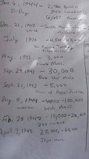 (Writing down dates in my sketchbook.)
I was getting frustrated with everything and kept putting off my project, so Mr. Sands said I could just scrap it. So I did. Instead, I decided to build an hourglass. I wanted to sculpt it and make it able to be held and seen. It was my second favorite idea on my list.
 (Rough draft sketch of hourglass.)
First off, I got two wine bottles from the still life cabinet. I can't exactly blow glass to make the hourglass, now can I? (I probably could if we had the tools and proper equipment to do so.) Anyways, I spent some time cleaning off the label and the sticky residue of ten-year-old-just-used-for-still-life glass.
 (See the bottles? I brought in a quill and some ink that day...
fun times spent doodling.)
(See the bottles? I brought in a quill and some ink that day...
fun times spent doodling.)
Now, I had to decide what to fill the bottles with. Beads, of course! To incorporate time, I put dates on the beads. But not any dates. Because I'm a weirdo and I save all my receipts, I just cut out the dates from them and glued them on the beads. Very time-consuming.
 (Look at my beautiful unexpectant-of-a-photograph face.)
 (That's much better. Look at the clean bottles!)
 (Ta-daaa! Dates! Don't mind my glued-up and slightly dirty fingers.
Glue is sticky. Things stick to sticky things. I am an art student.
You can't make art without getting dirty. :D)
(Ta-daaa! Dates! Don't mind my glued-up and slightly dirty fingers.
Glue is sticky. Things stick to sticky things. I am an art student.
You can't make art without getting dirty. :D)
The receipts are important because in looking at them, I could see what I bought, from where, and sometimes, for whom. I remember most of those occasions.
After all the beads were glued and dry, I put them in the bottles. The easiest way to get the bottles together was hot glue. So I glued it down and around the bottles. Now, I needed a base and something to hold up the base. Mr. Sands graciously cut out two identical circles of wood (that I traced using a bucket.) One side was painted white, so I just had to go in and make the other side match and sand them down. I then glued them to the bottom of the bottles. After that, I got three wooden dowels from the supply room and painted them black. I was going for a black & white color scheme here. Mr. Sands helped me to cut the dowels after we measured..but it was a rough measurement. The dowels didn't exactly slide in, they were about a centimeter or so off.
But then, something broke. In trying to get everything to fit, I accidentally pulled the bottles apart. The glue didn't hold them together anymore. So I had two bottles with wooden bases. I filled one bottle with the beads and glued the dowels down to each base. Voila!
Except, there was a space between the two bottles. Hello, hot glue.
 (I had to hold the bottles together so the glue would dry and
there would still be a hole the beads could slip through.)
(I had to hold the bottles together so the glue would dry and
there would still be a hole the beads could slip through.)
While hot gluing, it got really messy. So messy, in fact, that I just said, "To hell with it," and started a gluing frenzy. It ended up looking like melted candle wax and I enjoyed the look very much. So I kept it.

 (That stubborn bubble stayed for a bit and then popped.)
 (Yayyy! Done with my project!)
 (Happy!Kae)
 (Looking through the glass, you can make people's facial
features appear big or small, elongated or wider.)
(Looking through the glass, you can make people's facial
features appear big or small, elongated or wider.)
My Final Project


 RISKS
Uhm. Risks. Well, it was risky to switch my project idea halfway through. It was also risky to work with the mediums that I did because I'm not really knowledgeable about sculpture. A big risk for me was that hot glue though. As it turns out, it was a risk very much rewarded! Everyone seemed to really like my project.
RISKS
Uhm. Risks. Well, it was risky to switch my project idea halfway through. It was also risky to work with the mediums that I did because I'm not really knowledgeable about sculpture. A big risk for me was that hot glue though. As it turns out, it was a risk very much rewarded! Everyone seemed to really like my project.

Characteristics of Art
Technique: the way I put everything together and with the amount of care I showed.
Concept: My concept is that dates and memories are important to the passage of time
and the creation of human character.
Emotion: Without the written concept, I don't think people will have a strong reaction to my piece. Unless of course, they have good eyesight and notice the dates. Then maybe, they can draw their
own conclusion and meaning.
New: My idea is new in the sense that I replaced the sand with dates.
Medium: My overarching medium was sculpture. I used wine bottles, beads, receipts, hot glue, wood, wooden dowels, and black & white acrylic paint.
Sadly, the hourglass has to be at an angle to have all the beads flow through. It's very fragile as well. But all in all, I really loved this project and it's one of my favorite things I've ever made. :D
It's About Time!
Full View
Labels:
art class,
project,
sculpture
Presentation date: November 15, 2013
Time as an Element
Project number three is upon us! This time...it's all about time. Somehow, someway, we had to incorporate time into our artwork. Some people took this literally, by drawing clocks and such. Others took this figuratively. Some of my ideas included Clocks by Coldplay, something with a timing belt, hourglass, date stamps, melting candles, domino chain, or glowsticks.
I was also somewhat inspired by the image below.
(source: http://vimeo.com/56545572)
The first idea I chose was to take a date stamp and stamp dates with a huge death toll and have the last date be 9/11. In American culture, we are lead to believe that 9/11 was an extremely tragic day and we have memorials built all over the country. We even have one in our downtown. But there are other tragic days ALL over the world that no one knows about. We have the media portray our country as the victim...when sometimes, we're the main aggressor. I just wanted to show a comparison. But...through my research, there were so many dates and so many different forms of tragedy- mass killings, natural disasters, etc. I was overloaded with so much information that I just couldn't do it. I really want to do this project one day, just not now.
(Writing down dates in my sketchbook.)
I was getting frustrated with everything and kept putting off my project, so Mr. Sands said I could just scrap it. So I did. Instead, I decided to build an hourglass. I wanted to sculpt it and make it able to be held and seen. It was my second favorite idea on my list.
(Rough draft sketch of hourglass.)
First off, I got two wine bottles from the still life cabinet. I can't exactly blow glass to make the hourglass, now can I? (I probably could if we had the tools and proper equipment to do so.) Anyways, I spent some time cleaning off the label and the sticky residue of ten-year-old-just-used-for-still-life glass.
(See the bottles? I brought in a quill and some ink that day...
fun times spent doodling.)
Now, I had to decide what to fill the bottles with. Beads, of course! To incorporate time, I put dates on the beads. But not any dates. Because I'm a weirdo and I save all my receipts, I just cut out the dates from them and glued them on the beads. Very time-consuming.
(Look at my beautiful unexpectant-of-a-photograph face.)
(That's much better. Look at the clean bottles!)
(Ta-daaa! Dates! Don't mind my glued-up and slightly dirty fingers.
Glue is sticky. Things stick to sticky things. I am an art student.
You can't make art without getting dirty. :D)
The receipts are important because in looking at them, I could see what I bought, from where, and sometimes, for whom. I remember most of those occasions.
After all the beads were glued and dry, I put them in the bottles. The easiest way to get the bottles together was hot glue. So I glued it down and around the bottles. Now, I needed a base and something to hold up the base. Mr. Sands graciously cut out two identical circles of wood (that I traced using a bucket.) One side was painted white, so I just had to go in and make the other side match and sand them down. I then glued them to the bottom of the bottles. After that, I got three wooden dowels from the supply room and painted them black. I was going for a black & white color scheme here. Mr. Sands helped me to cut the dowels after we measured..but it was a rough measurement. The dowels didn't exactly slide in, they were about a centimeter or so off.
But then, something broke. In trying to get everything to fit, I accidentally pulled the bottles apart. The glue didn't hold them together anymore. So I had two bottles with wooden bases. I filled one bottle with the beads and glued the dowels down to each base. Voila!
Except, there was a space between the two bottles. Hello, hot glue.
(I had to hold the bottles together so the glue would dry and
there would still be a hole the beads could slip through.)
While hot gluing, it got really messy. So messy, in fact, that I just said, "To hell with it," and started a gluing frenzy. It ended up looking like melted candle wax and I enjoyed the look very much. So I kept it.
(That stubborn bubble stayed for a bit and then popped.)
(Yayyy! Done with my project!)
(Happy!Kae)
(Looking through the glass, you can make people's facial
features appear big or small, elongated or wider.)
My Final Project
RISKS
Uhm. Risks. Well, it was risky to switch my project idea halfway through. It was also risky to work with the mediums that I did because I'm not really knowledgeable about sculpture. A big risk for me was that hot glue though. As it turns out, it was a risk very much rewarded! Everyone seemed to really like my project.
Characteristics of Art
Technique: the way I put everything together and with the amount of care I showed.
Concept: My concept is that dates and memories are important to the passage of time
and the creation of human character.
Emotion: Without the written concept, I don't think people will have a strong reaction to my piece. Unless of course, they have good eyesight and notice the dates. Then maybe, they can draw their
own conclusion and meaning.
New: My idea is new in the sense that I replaced the sand with dates.
Medium: My overarching medium was sculpture. I used wine bottles, beads, receipts, hot glue, wood, wooden dowels, and black & white acrylic paint.
Sadly, the hourglass has to be at an angle to have all the beads flow through. It's very fragile as well. But all in all, I really loved this project and it's one of my favorite things I've ever made. :D
Project Number Two!
Intertexuality:
I had many ideas for this one, including The Great Catsby, an Alexander
Calder-esque mobile with mobile phones (I'm still very fond of this idea), the
combination of Narnia and the Wizard of Oz, The Giving Tree giving Mario a
coin, and having Katniss from the Hunger Games shooting at the Target logo.


I decided to go with the latter because my best friend looks like
Katniss. Seriously. (I also could've cut out paper silhouettes, but eh. I
did, however, create the Target logo out of paper.)
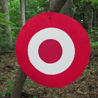
Because she's a perfect living replica, I decided I wanted to use the medium of
photography, along with editing some photos in Photoshop. We got together on
Wednesday, September 25, because it was a day we both were free. Suffering the
wrath of spiderwebs and the threat of oncoming rain, we waltzed through the
woods.  She shoots...
 She shoots...
 She's still shooting...
 (Oh, hello, little bug.)
 Blurrr
 Wow, awesome facial expression!
 La la la...
 Tra la la...
 Don't mess with Katniss!
 Landscape!
 Black and white is awesome...
 BAM!
BAM!

 WOW!
WOW!
 Her face. Is. Awesome.
I don't really having much experience directing, but I know what kind of look
I'm going for in my photography. I also have the added bonus of snapping the
perfect picture at the right time.
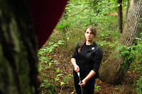
A had no idea what she was doing at first, but she's a quick learner. 

My project demonstrates intertexuality by adding Katniss to
the Target logo. I furthered the meaning along by adding little slogans using Photoshop that
make sense if you're into Hunger Games.


 Sing More. Rue Less. Katniss sang a
song for her dying friend name Rue. I'm horrible, I know.
Sing More. Rue Less. Katniss sang a
song for her dying friend name Rue. I'm horrible, I know.

The
other was Expect More. Stabs Mahogany. ---Making fun of the scene where Katniss
stabs a table with her knife and this superficial lady cries out, "That is
MAHOGANY!"
 The third was a simple Target ad with Expect More. Pay less.
My Risk Assesment
I love doing photography in my spare time, usually leaning
towards candid photography, lifestyle potraits, black & white, and nature.
I sometimes do modeling photo-shoots with another best friend, so I'm used to
this. However, I'm not used to directing someone else around and this was a new
experience. I also got to use Photoshop again in very different ways from my
first project. (Thank you, Robbie, for all your help with my Photoshop
questions~)
P.S. My lesser risks included: walking through THREE spiderwebs
(which I'm terrified of), getting lots of bugbites, and being rained on.
:(
Characteristics of Great Art
- Technique: my
photography skills are improving each time I pick up my camera. I always
look for lighting and composition- I want to make sure the whole picture
is amazing. I always look for different angles or something that may bring
a different element to the scene. (pic of tree in front)
- Concept:
my concept was to display something humorous that those in the Hunger
Games fandom would understand.
- Emotion:
I tried to be funny with my logos. I really did. :) On a more serious
note, each photograph displays a different emotion. For example, using
black & white always makes me feel solemn and that the photo is
elegant.
- New:
uhm...Mr. Sands said this would be very hard to accomplish. But, the
internet doesn't have any Katniss + Target logos floating around, so that
idea is new.
- Medium:
my medium was a paper logo, photography, and enhancements in
Photoshop.
Bonus Video:
Blooper pictures:

 Derp..

RAWR
 Katniss, you're not supposed to have a cell phone!
Really, Katniss?
All in all, this was a new and very memorable experience.
I Volunteer as Model!
Full View
Labels:
art class,
Hunger Games,
Katniss,
photography,
photoshop,
project,
Target
Project Number Two!
Intertexuality:
the shaping of a text meaning by another text (Thank you,
Wikipedia!)
I had many ideas for this one, including The Great Catsby, an Alexander
Calder-esque mobile with mobile phones (I'm still very fond of this idea), the
combination of Narnia and the Wizard of Oz, The Giving Tree giving Mario a
coin, and having Katniss from the Hunger Games shooting at the Target logo.
I decided to go with the latter because my best friend looks like
Katniss. Seriously. (I also could've cut out paper silhouettes, but eh. I
did, however, create the Target logo out of paper.)
Because she's a perfect living replica, I decided I wanted to use the medium of
photography, along with editing some photos in Photoshop. We got together on
Wednesday, September 25, because it was a day we both were free. Suffering the
wrath of spiderwebs and the threat of oncoming rain, we waltzed through the
woods.
She shoots...
She shoots...
She's still shooting...
(Oh, hello, little bug.)
Blurrr
Wow, awesome facial expression!
La la la...
Tra la la...
Don't mess with Katniss!
Landscape!
Black and white is awesome...
BAM!
WOW!
Her face. Is. Awesome.
I don't really having much experience directing, but I know what kind of look
I'm going for in my photography. I also have the added bonus of snapping the
perfect picture at the right time.
A had no idea what she was doing at first, but she's a quick learner.
My project demonstrates intertexuality by adding Katniss to
the Target logo. I furthered the meaning along by adding little slogans using Photoshop that
make sense if you're into Hunger Games.
Sing More. Rue Less. Katniss sang a
song for her dying friend name Rue. I'm horrible, I know.
The
other was Expect More. Stabs Mahogany. ---Making fun of the scene where Katniss
stabs a table with her knife and this superficial lady cries out, "That is
MAHOGANY!"
The third was a simple Target ad with Expect More. Pay less.
My Risk Assesment
I love doing photography in my spare time, usually leaning
towards candid photography, lifestyle potraits, black & white, and nature.
I sometimes do modeling photo-shoots with another best friend, so I'm used to
this. However, I'm not used to directing someone else around and this was a new
experience. I also got to use Photoshop again in very different ways from my
first project. (Thank you, Robbie, for all your help with my Photoshop
questions~)
P.S. My lesser risks included: walking through THREE spiderwebs
(which I'm terrified of), getting lots of bugbites, and being rained on.
:(
Characteristics of Great Art
- Technique: my
photography skills are improving each time I pick up my camera. I always
look for lighting and composition- I want to make sure the whole picture
is amazing. I always look for different angles or something that may bring
a different element to the scene. (pic of tree in front)
- Concept:
my concept was to display something humorous that those in the Hunger
Games fandom would understand.
- Emotion:
I tried to be funny with my logos. I really did. :) On a more serious
note, each photograph displays a different emotion. For example, using
black & white always makes me feel solemn and that the photo is
elegant.
- New:
uhm...Mr. Sands said this would be very hard to accomplish. But, the
internet doesn't have any Katniss + Target logos floating around, so that
idea is new.
- Medium: my medium was a paper logo, photography, and enhancements in Photoshop.
Bonus Video:
Blooper pictures:
Derp..
|
| RAWR |
Katniss, you're not supposed to have a cell phone!

Really, Katniss?
All in all, this was a new and very memorable experience.
When trying new things, "May the odds be ever in your favor."


