


Showing posts with label photoshop. Show all posts
Project Number Two!
Intertexuality:
I had many ideas for this one, including The Great Catsby, an Alexander
Calder-esque mobile with mobile phones (I'm still very fond of this idea), the
combination of Narnia and the Wizard of Oz, The Giving Tree giving Mario a
coin, and having Katniss from the Hunger Games shooting at the Target logo.


I decided to go with the latter because my best friend looks like
Katniss. Seriously. (I also could've cut out paper silhouettes, but eh. I
did, however, create the Target logo out of paper.)
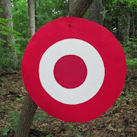
Because she's a perfect living replica, I decided I wanted to use the medium of
photography, along with editing some photos in Photoshop. We got together on
Wednesday, September 25, because it was a day we both were free. Suffering the
wrath of spiderwebs and the threat of oncoming rain, we waltzed through the
woods.  She shoots...
 She shoots...
 She's still shooting...
 (Oh, hello, little bug.)
 Blurrr
 Wow, awesome facial expression!
 La la la...
 Tra la la...
 Don't mess with Katniss!
 Landscape!
 Black and white is awesome...
 BAM!
BAM!

 WOW!
WOW!
 Her face. Is. Awesome.
I don't really having much experience directing, but I know what kind of look
I'm going for in my photography. I also have the added bonus of snapping the
perfect picture at the right time.
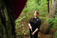
A had no idea what she was doing at first, but she's a quick learner. 

My project demonstrates intertexuality by adding Katniss to
the Target logo. I furthered the meaning along by adding little slogans using Photoshop that
make sense if you're into Hunger Games.


 Sing More. Rue Less. Katniss sang a
song for her dying friend name Rue. I'm horrible, I know.
Sing More. Rue Less. Katniss sang a
song for her dying friend name Rue. I'm horrible, I know.

The
other was Expect More. Stabs Mahogany. ---Making fun of the scene where Katniss
stabs a table with her knife and this superficial lady cries out, "That is
MAHOGANY!"
 The third was a simple Target ad with Expect More. Pay less.
My Risk Assesment
I love doing photography in my spare time, usually leaning
towards candid photography, lifestyle potraits, black & white, and nature.
I sometimes do modeling photo-shoots with another best friend, so I'm used to
this. However, I'm not used to directing someone else around and this was a new
experience. I also got to use Photoshop again in very different ways from my
first project. (Thank you, Robbie, for all your help with my Photoshop
questions~)
P.S. My lesser risks included: walking through THREE spiderwebs
(which I'm terrified of), getting lots of bugbites, and being rained on.
:(
Characteristics of Great Art
- Technique: my
photography skills are improving each time I pick up my camera. I always
look for lighting and composition- I want to make sure the whole picture
is amazing. I always look for different angles or something that may bring
a different element to the scene. (pic of tree in front)
- Concept:
my concept was to display something humorous that those in the Hunger
Games fandom would understand.
- Emotion:
I tried to be funny with my logos. I really did. :) On a more serious
note, each photograph displays a different emotion. For example, using
black & white always makes me feel solemn and that the photo is
elegant.
- New:
uhm...Mr. Sands said this would be very hard to accomplish. But, the
internet doesn't have any Katniss + Target logos floating around, so that
idea is new.
- Medium:
my medium was a paper logo, photography, and enhancements in
Photoshop.
Bonus Video:
Blooper pictures:

 Derp..

RAWR
 Katniss, you're not supposed to have a cell phone!
Really, Katniss?
All in all, this was a new and very memorable experience.
I Volunteer as Model!
Full View
Labels:
art class,
Hunger Games,
Katniss,
photography,
photoshop,
project,
Target
Project Number Two!
Intertexuality:
the shaping of a text meaning by another text (Thank you,
Wikipedia!)
I had many ideas for this one, including The Great Catsby, an Alexander
Calder-esque mobile with mobile phones (I'm still very fond of this idea), the
combination of Narnia and the Wizard of Oz, The Giving Tree giving Mario a
coin, and having Katniss from the Hunger Games shooting at the Target logo.
I decided to go with the latter because my best friend looks like
Katniss. Seriously. (I also could've cut out paper silhouettes, but eh. I
did, however, create the Target logo out of paper.)
Because she's a perfect living replica, I decided I wanted to use the medium of
photography, along with editing some photos in Photoshop. We got together on
Wednesday, September 25, because it was a day we both were free. Suffering the
wrath of spiderwebs and the threat of oncoming rain, we waltzed through the
woods.
She shoots...
She shoots...
She's still shooting...
(Oh, hello, little bug.)
Blurrr
Wow, awesome facial expression!
La la la...
Tra la la...
Don't mess with Katniss!
Landscape!
Black and white is awesome...
BAM!
WOW!
Her face. Is. Awesome.
I don't really having much experience directing, but I know what kind of look
I'm going for in my photography. I also have the added bonus of snapping the
perfect picture at the right time.
A had no idea what she was doing at first, but she's a quick learner.
My project demonstrates intertexuality by adding Katniss to
the Target logo. I furthered the meaning along by adding little slogans using Photoshop that
make sense if you're into Hunger Games.
Sing More. Rue Less. Katniss sang a
song for her dying friend name Rue. I'm horrible, I know.
The
other was Expect More. Stabs Mahogany. ---Making fun of the scene where Katniss
stabs a table with her knife and this superficial lady cries out, "That is
MAHOGANY!"
The third was a simple Target ad with Expect More. Pay less.
My Risk Assesment
I love doing photography in my spare time, usually leaning
towards candid photography, lifestyle potraits, black & white, and nature.
I sometimes do modeling photo-shoots with another best friend, so I'm used to
this. However, I'm not used to directing someone else around and this was a new
experience. I also got to use Photoshop again in very different ways from my
first project. (Thank you, Robbie, for all your help with my Photoshop
questions~)
P.S. My lesser risks included: walking through THREE spiderwebs
(which I'm terrified of), getting lots of bugbites, and being rained on.
:(
Characteristics of Great Art
- Technique: my
photography skills are improving each time I pick up my camera. I always
look for lighting and composition- I want to make sure the whole picture
is amazing. I always look for different angles or something that may bring
a different element to the scene. (pic of tree in front)
- Concept:
my concept was to display something humorous that those in the Hunger
Games fandom would understand.
- Emotion:
I tried to be funny with my logos. I really did. :) On a more serious
note, each photograph displays a different emotion. For example, using
black & white always makes me feel solemn and that the photo is
elegant.
- New:
uhm...Mr. Sands said this would be very hard to accomplish. But, the
internet doesn't have any Katniss + Target logos floating around, so that
idea is new.
- Medium: my medium was a paper logo, photography, and enhancements in Photoshop.
Bonus Video:
Blooper pictures:
Derp..
|
| RAWR |
Katniss, you're not supposed to have a cell phone!

Really, Katniss?
All in all, this was a new and very memorable experience.
When trying new things, "May the odds be ever in your favor."

Our first project in Art Three was to incorporate text as an element, using the word 'Culture' as the basis of our theme. We had to brainstorm about twenty ideas that first came to mind (some of mine included languages, Starbucks, bathroom stalls, McDonald's, mythology, and culture-shock.) Next, taking ten of those ideas and narrowing them down and adding meanings in (American culture- Starbucks, music provides entertainment, graffitti provides inspiration, small towns promote community, etc.)
 When Mr. Sands gave an example of an idea, saying culture-shock, I
suddenly had this image of the Starbucks siren with lightning flashing
and zapped hair. So, I chose Starbucks. It's a national symbol of early mornings, people rushing to work, a place for people to hang out in the afternoon, and a huge waste of money (if you go there everyday.) I don't hate Starbucks, I love their vanilla frappuchinos and I get one every once in a while. Starbucks, to me, was the easiest to make fun of.
When Mr. Sands gave an example of an idea, saying culture-shock, I
suddenly had this image of the Starbucks siren with lightning flashing
and zapped hair. So, I chose Starbucks. It's a national symbol of early mornings, people rushing to work, a place for people to hang out in the afternoon, and a huge waste of money (if you go there everyday.) I don't hate Starbucks, I love their vanilla frappuchinos and I get one every once in a while. Starbucks, to me, was the easiest to make fun of.
My original idea was just to have one symbol. Mr. Sands mentioned that it might be cool to have about three. I went with that idea and tried to come up with different characters.

My next challenge was to decide upon the text to replace the Starbucks Coffee logo. My friend, Michelle, gave me inspiration for one when she mentioned, "..white, upper-class wastefulness." I decided on three phrases, 'Duckface wastefulness', 'Burn your money', and 'Before it was cool.'

I decided I wanted to use photoshop as my medium because it would be easiest for coloring and to manipulate the images. Also, I have never used photoshop before, and I wanted to try it out. That was my risk for this project. But before getting started, I had to have a final draft of my images to copy onto photoshop. (sketch

After getting my picture into photoshop, I used a number of techniques. First, I had to outline my drawing and use the fill bucket to color in the black and white in the middle circle. After that, Mr. Sands lent me the Bamboo tablet and stylus, which I used to make my lines (especially on the hair) more smooth. I used the fill bucket for the green circle, as well. Mr. Sands helped me copy the star from the logo and I had to copy it to make six of them.
Now, it was time for the text, which was the hardest part. Mr. Sands showed me how to make the text curve around, but for the life of me, I could not get it to fit. The text would not curve and when it did, it didn't curve fully around the circle, like I wanted it to. Then Mr. Sands said that I would hate him because I would have to type it out letter by letter. I didn't mind. :) It was a lot easier than figuring out that curve.
Letter by letter, I typed out my logos during Thursday's lunch period.

Here is my final project. I wanted to portray some stereotypes of people I thought would go to Starbucks a lot. Except for the 'Burn your money' one. That meaning should be obvious.
~Kae

Culture-Shock
Full View
Labels:
art class,
photoshop,
project
My original idea was just to have one symbol. Mr. Sands mentioned that it might be cool to have about three. I went with that idea and tried to come up with different characters.
My next challenge was to decide upon the text to replace the Starbucks Coffee logo. My friend, Michelle, gave me inspiration for one when she mentioned, "..white, upper-class wastefulness." I decided on three phrases, 'Duckface wastefulness', 'Burn your money', and 'Before it was cool.'
I decided I wanted to use photoshop as my medium because it would be easiest for coloring and to manipulate the images. Also, I have never used photoshop before, and I wanted to try it out. That was my risk for this project. But before getting started, I had to have a final draft of my images to copy onto photoshop. (sketch
After getting my picture into photoshop, I used a number of techniques. First, I had to outline my drawing and use the fill bucket to color in the black and white in the middle circle. After that, Mr. Sands lent me the Bamboo tablet and stylus, which I used to make my lines (especially on the hair) more smooth. I used the fill bucket for the green circle, as well. Mr. Sands helped me copy the star from the logo and I had to copy it to make six of them.
Now, it was time for the text, which was the hardest part. Mr. Sands showed me how to make the text curve around, but for the life of me, I could not get it to fit. The text would not curve and when it did, it didn't curve fully around the circle, like I wanted it to. Then Mr. Sands said that I would hate him because I would have to type it out letter by letter. I didn't mind. :) It was a lot easier than figuring out that curve.
Letter by letter, I typed out my logos during Thursday's lunch period.
Here is my final project. I wanted to portray some stereotypes of people I thought would go to Starbucks a lot. Except for the 'Burn your money' one. That meaning should be obvious.
~Kae


